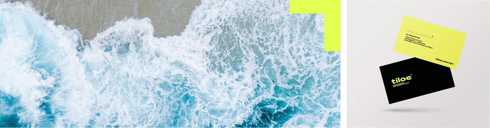
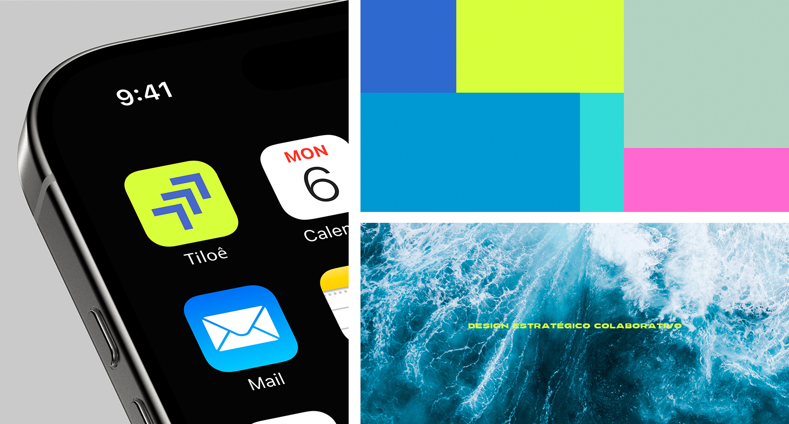
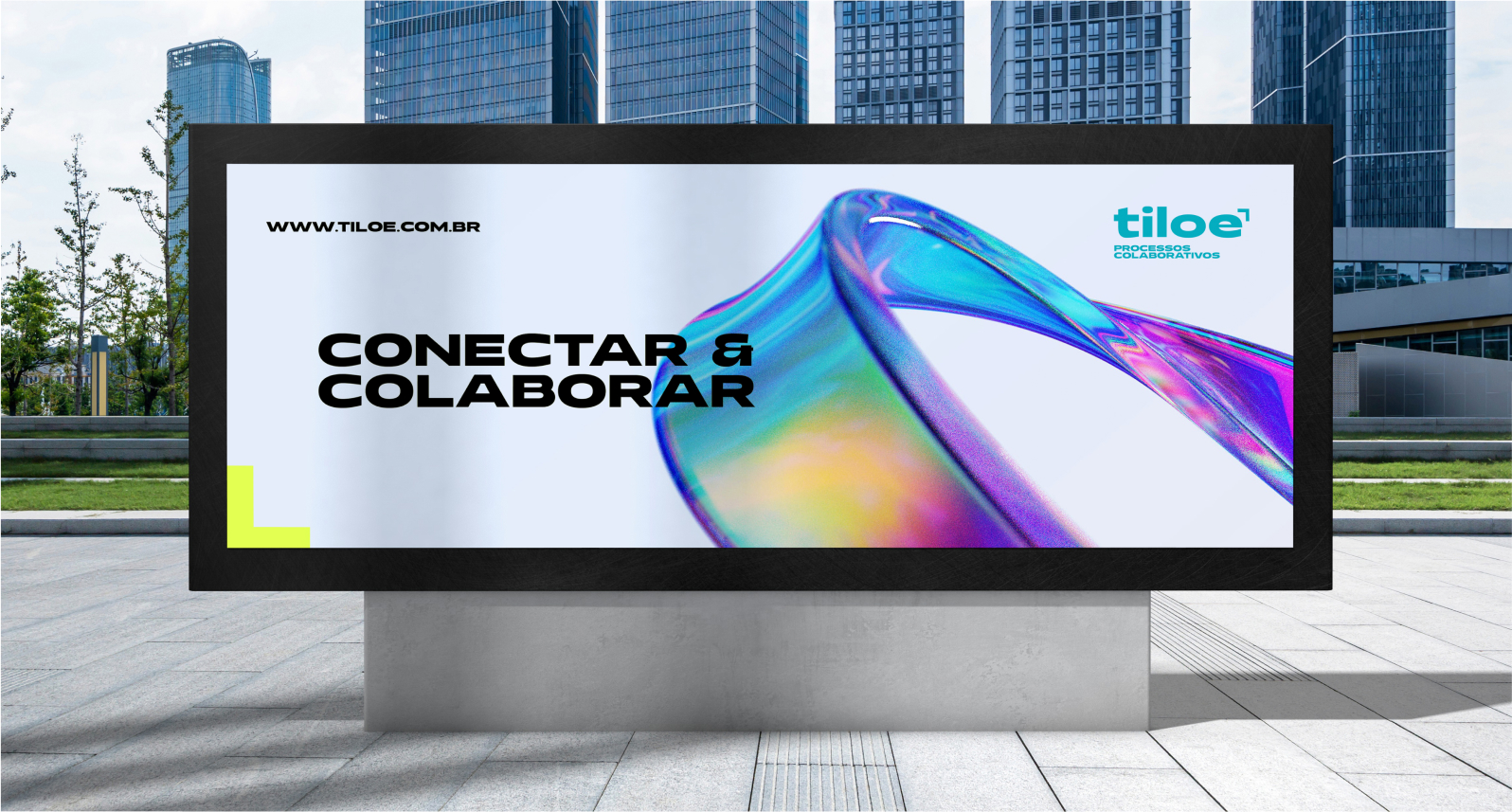
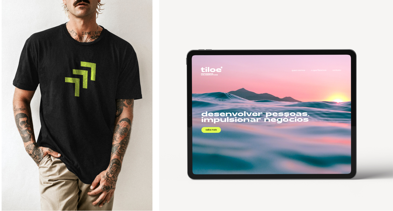
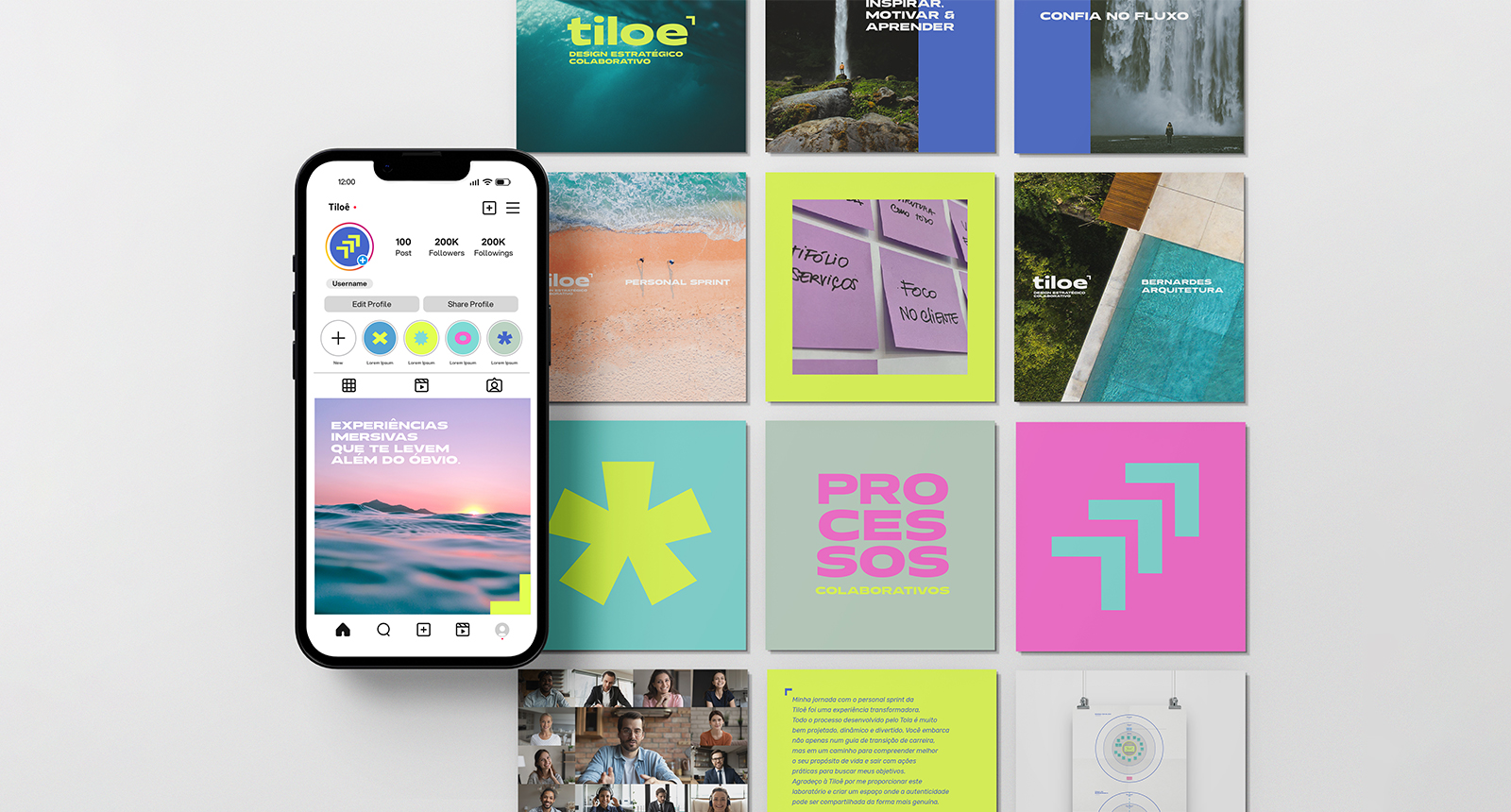
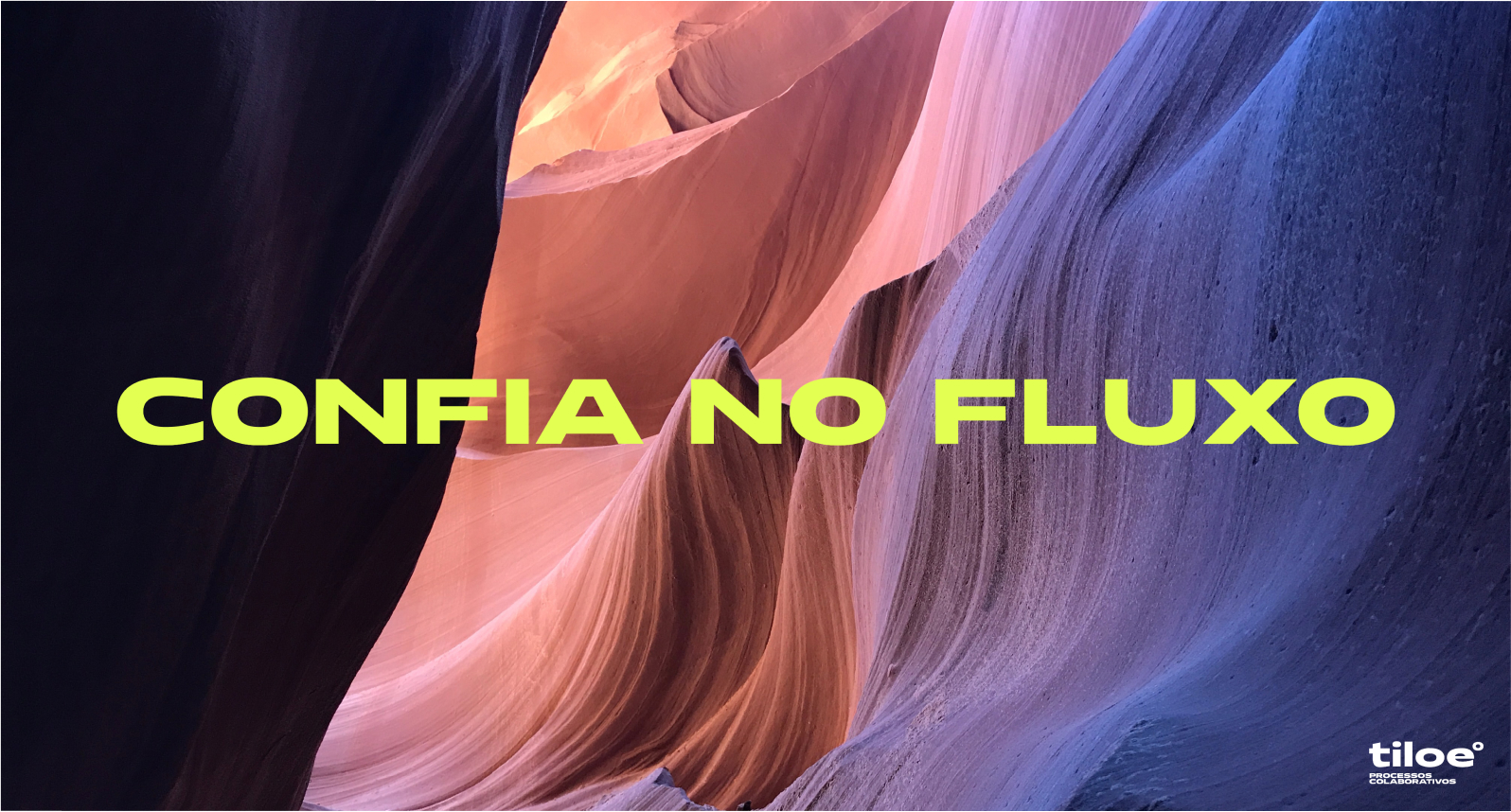
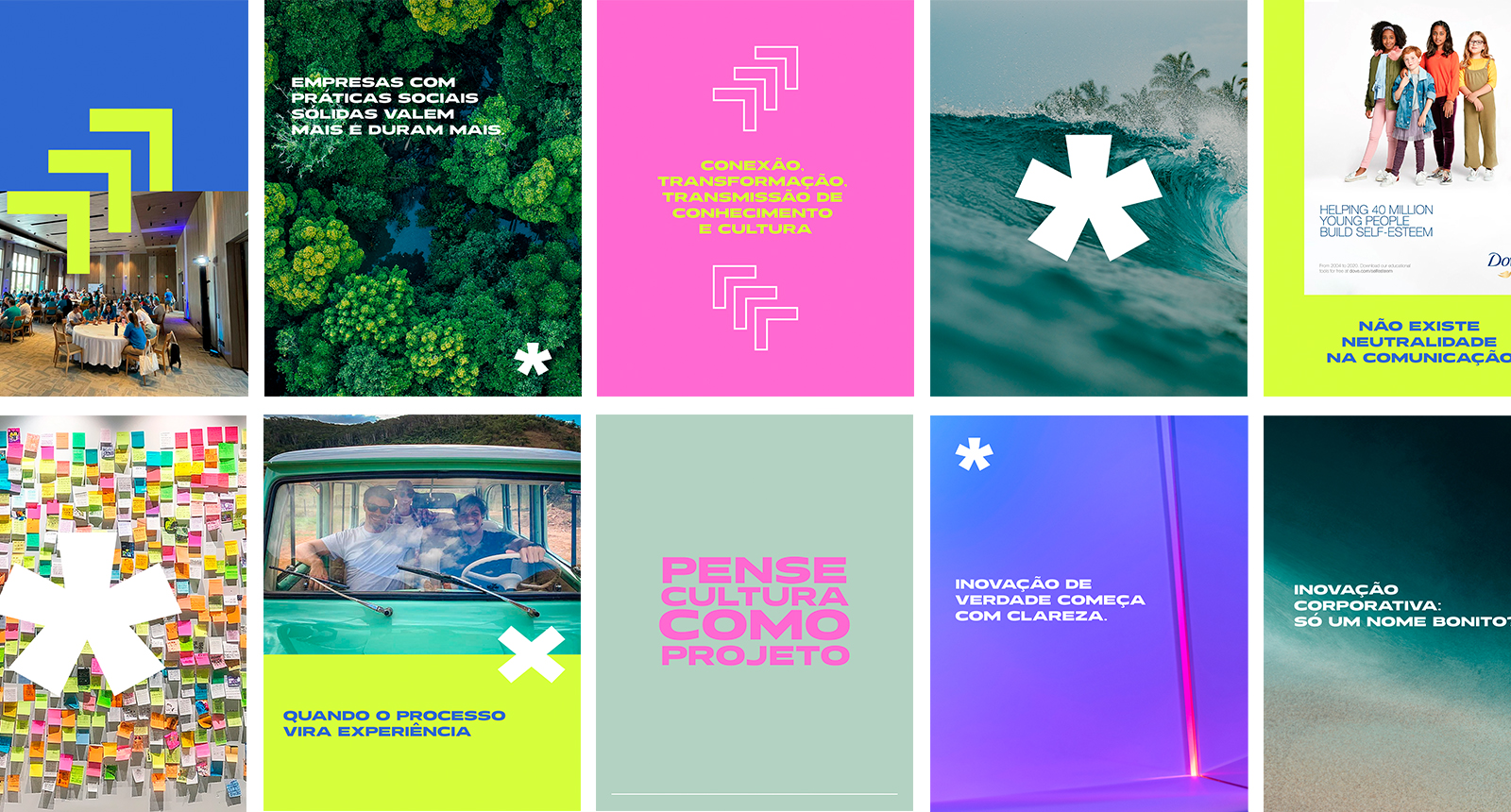
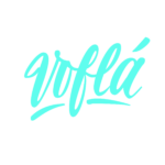
Identidade Visual para companhia de processos. Com o desafio de criar uma identidade visual para a marca a partir de um nome que o empreendedor trouxe para o projeto, tiloê tem um significado especial e carrega no nome o significado da exploração, da busca por novos ares. Partindo dessa premissa chegamos a um símbolo que representasse esse sentimento, com uma deslocada do acento circunflexo remetendo uma asa, uma gaivota e uma seta que apontam sempre para frente. A marca ainda ganhou novos desenhos para se comunicar gerando um sistema de símbolos identitários que servem de apoio para os mais diferentes assuntos tratados na comunicação.
Visual Identity for a process company. With the challenge of creating a visual identity for the brand based on a name that the entrepreneur brought to the project, tiloê has a special meaning and carries in its name the meaning of exploration, of the search for new areas. Starting from this premise, we came up with a symbol that represented this feeling, with a displacement of the circumflex marking a wing, a seagull and an arrow that always point forward. The brand also gained new designs to communicate, generating a system of identity symbols that serve as support for the most different subjects covered in communication.