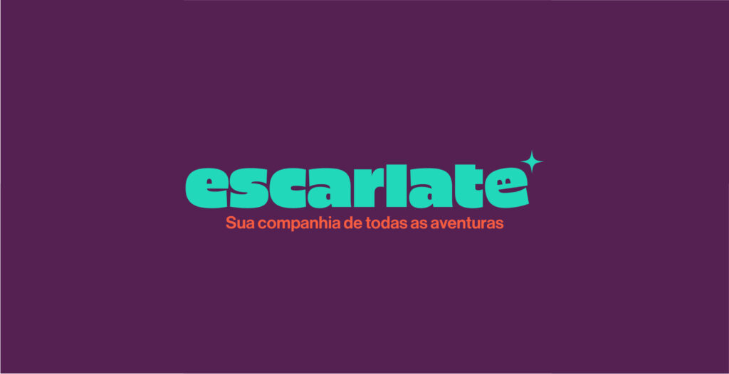
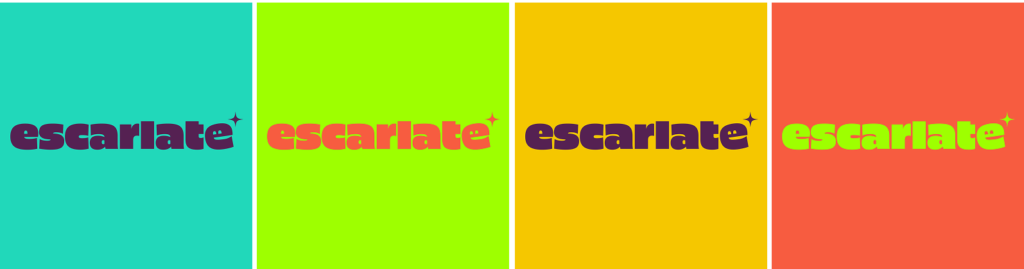
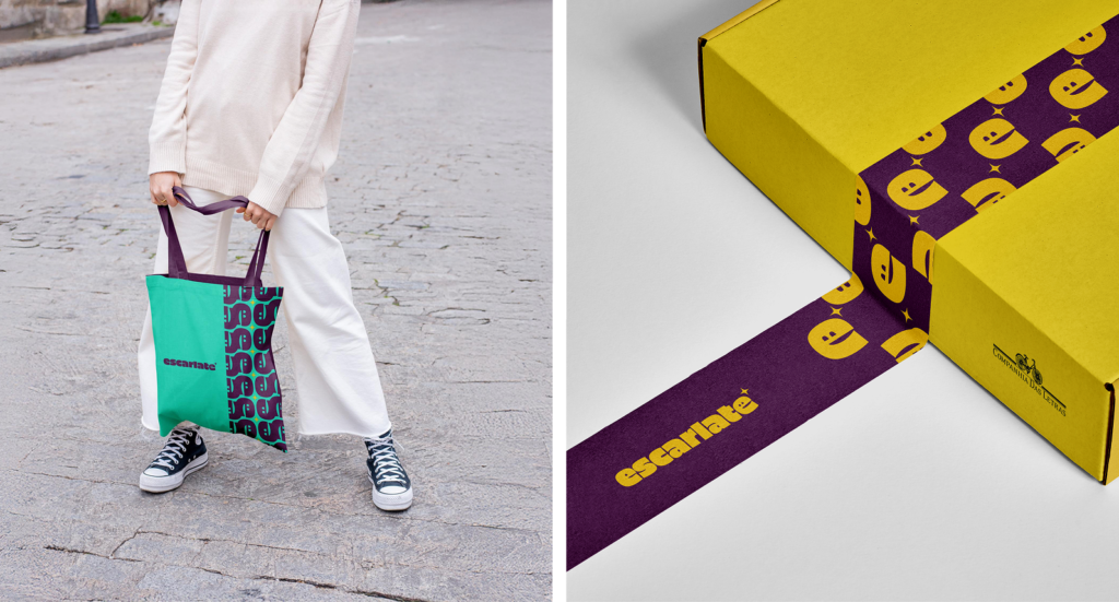
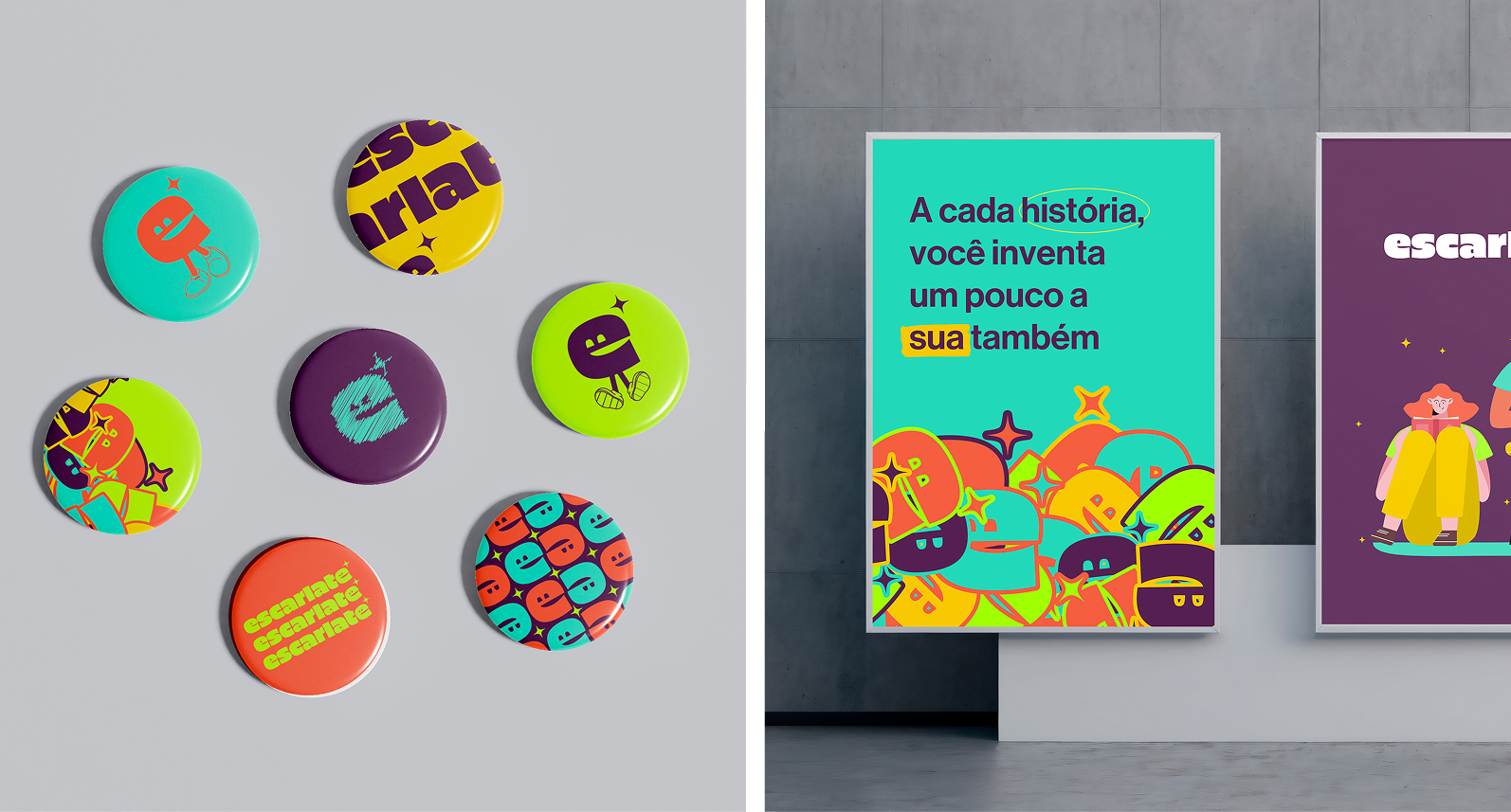
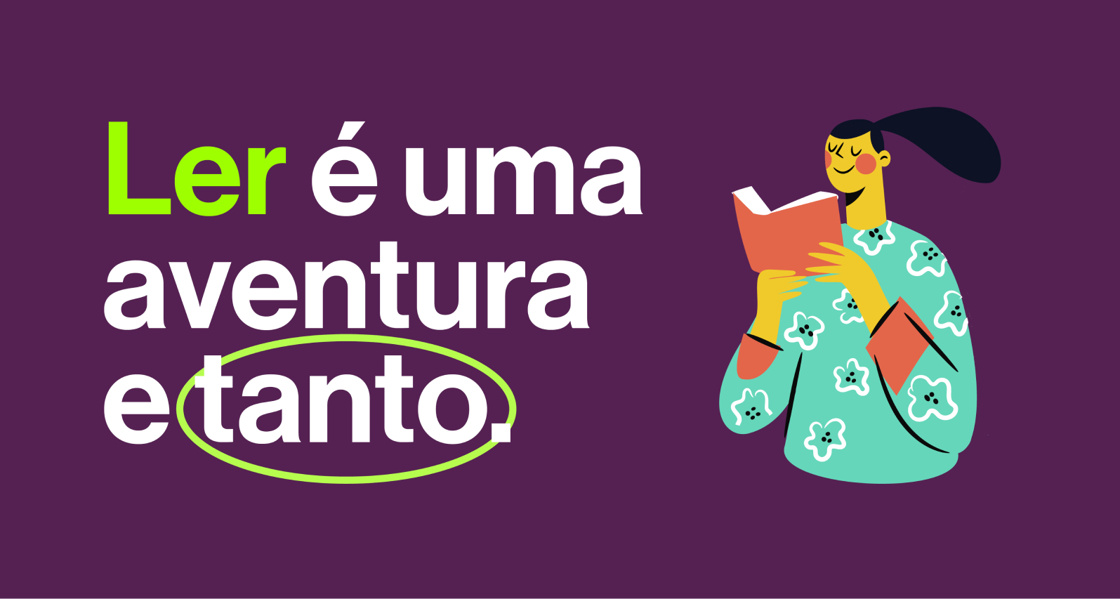
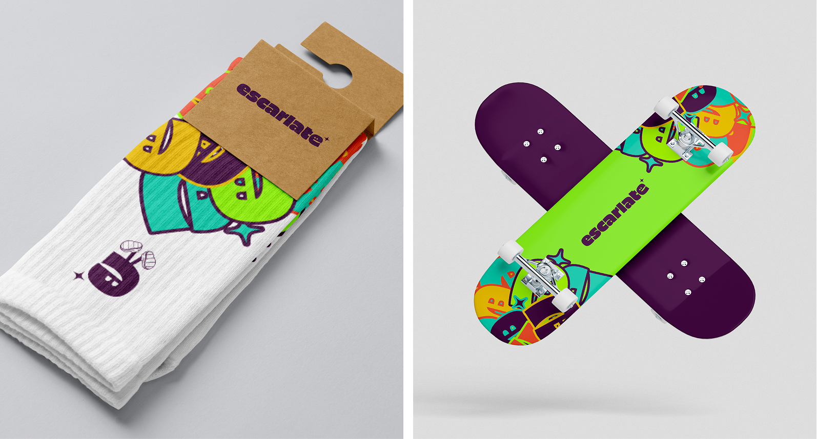
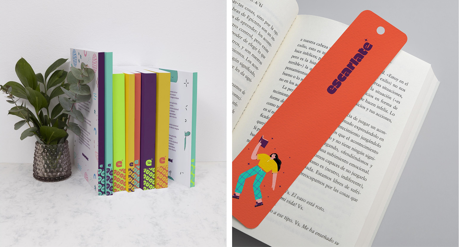
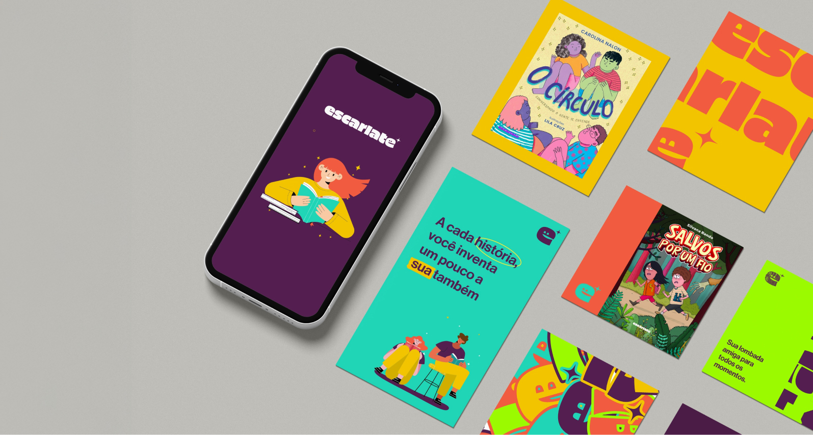
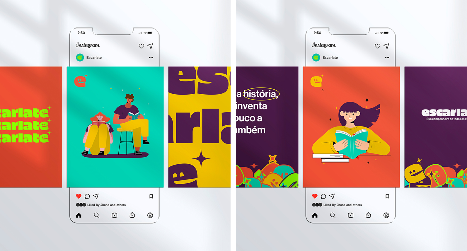
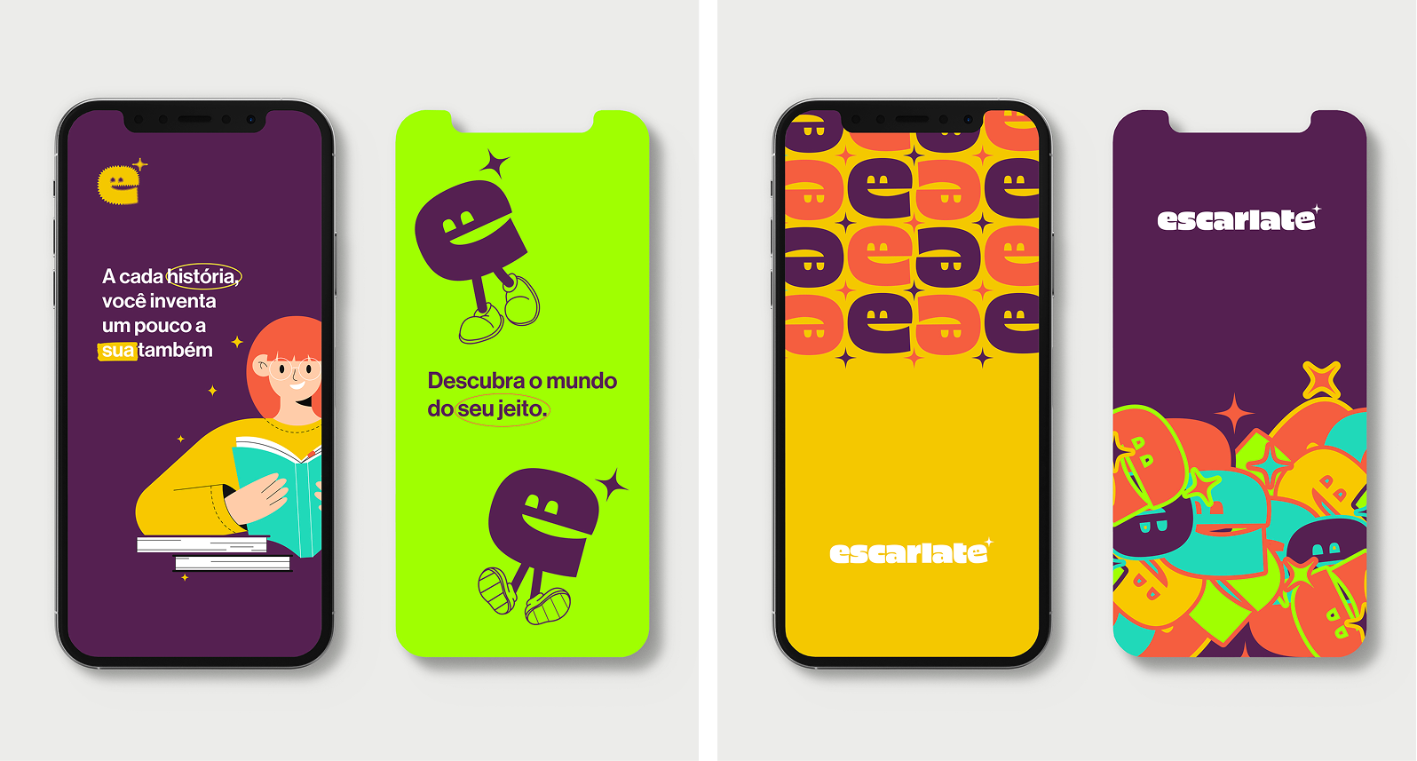
Criar a identidade do selo Escarlate, da Companhia das Letras, foi um convite para mergulhar no universo vibrante da literatura infantojuvenil com olhar contemporâneo. Voltado a leitores em formação – curiosos, inquietos e em constante descoberta – o selo pedia uma linguagem visual à altura de sua proposta: dinâmica, jovem e acessível, sem perder a inteligência e a qualidade editorial que marcam a companhia. Trabalho desenvolvido em parceria com a Tiloê.
Designing the visual identity for Escarlate, the Companhia das Letras imprint for children and young adult literature, was an invitation to dive into a vibrant and ever-evolving literary universe. Aimed at readers in formation — curious, restless, and constantly discovering — the imprint called for a visual language that felt dynamic, youthful, and approachable, without compromising the editorial quality and intelligence that define the publishing house. Work developed in partnership with Tiloê.